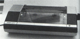
At last some joy for 1029 owners. J.D. Collins
finds a way to get true descenders and more fonts

Running a home computer system on a tight budget is
never easy, especially when you are tempted by luxury versions of
your basic equipment. Owners of 1029 printers will share my envy of
the features available on more expensive printers, and will realise
why I just had to have FONT 4 when I recently saw it advertised. At
around £25 it seemed a good way of upgrading my 1029 to give three
new font styles in addition to the standard font.
For your money you get a small board mounted chip
with a short length of wire and a switch attached, all vacuum packed
in a wrapper that says 'Commodore compatible'! That gave me a
moments anguish, but the instructions clearly referred to Atari
printers so I went ahead. One initial warning if you buy, be careful
how you remove the wrapper as the instruction sheet seems stuck to
it!
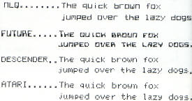
The three new font styles are – Near Letter Quality,
Descender and Future. The difference between Descender and the
standard font seems small but you have enough of a tail on p's, y's
and q's etc. to make a noticeable difference to readability and
presentation. The NLQ font gives a square cut style, dramatically
different from the Atari font though I personally found this font
less impressive than I had expected. The limitations of a seven pin
print head, I suppose? The third new font is Future, similar to the
'computer' style that was fashionable on cheques a few years ago.
Future font is very impressive in upper case and expanded text but
in lower case you just get smaller uppercase style letters, not a
real change in style. Maybe this is a correct feature of the font,
perhaps the Editor can tell us? (A font does not necessarily have
to have 'lower case' letters, there is a standard, but little used,
font variation in typesetting called Small Caps. Ed.). The
instructions also claim that you can use all fonts in reverse video
but I have been unable to do this this so far. Graphics printing is
not affected by the chip.

The different fonts available with Font 4
FITTING IT
The instructions for fitting the chip are clear and
accurate but this gave me the biggest headache. I have some
experience of circuit boards from my (long ago) college days and I
have fitted chips on other equipment but going inside your hardware
with a screwdriver and such is never easy and should always be done
with caution. Apart from anything else, it will invalidate your
warranty, making it expensive if anything goes wrong.
The insides of a 1029 don't give much room for
messing about so take care and GO SLOWLY. Actually the hardest part
is mounting the switch on the case of the printer. You should choose
a spot which will be easy to reach when the case is re-assembled and
be very careful where and how you drill holes! I choose a point on
the top of the case at the back right hand corner where there is
only one wire to avoid under the case. I drilled two quarter inch
holes and then carved the edges into a square just big enough to
accept and grip the switch without further drilling of screw holes.
The installation took me a couple of hours spread over two nights,
which sounds a lot of work, but better safe than sorry I thought!
WORTH IT?
Was it worth it? Yes! Although you can't switch
between fonts under software control and the print isn't as good as,
say, the 1027 printer, I am very happy with the result both on the
printer casing and in the print quality. I feel the cost of the
replacement ROM was well worth the effort especially as my warranty
had already expired. If you don't want all the extra fonts, you can
get a Descender font only chip for £12.99 but it might seem like a
lot of work for just one font.
I have only one complaint. It didn't make it any
easier to coax the £ sign out of the printer! Seriously though, FONT
4 will really breathe new life into your 1029.
top